Bespoke Service
All designs can be created in different colours to match your wedding colour scheme.
To put a more personal mark on your stationery, why not commission your own design? Just tell us what you have in mind and we'll work with your ideas to create a one-off personal design.
Bespoke designs can be influenced by anything from the colour scheme for your wedding, to the time of year your wedding is being held or the flowers you have chosen for your big day. It could simply be influenced by something personal to you both and your wedding day. Good ideas and inspiration can be found in many wedding or interior design magazines. You can send any images you have collected to us if you feel it will help you to get your ideas across.
We'll work with your ideas and send a range of sample designs along with quotes. Prices shouldn't vary too much from our standard design range. They will be based mainly on the complexity of the design and the materials used. If preferred, you can let us know your budget and we will design with that in mind.
Variations can also be made in the colour, texture, size and shape of the card as well as the paper used for the insert.
As designing can take time, there is an additional one-off charge for this service, depending on the complexity of the design (From £40). There is no charge for colour changes or small, simple changes to my standard design range.
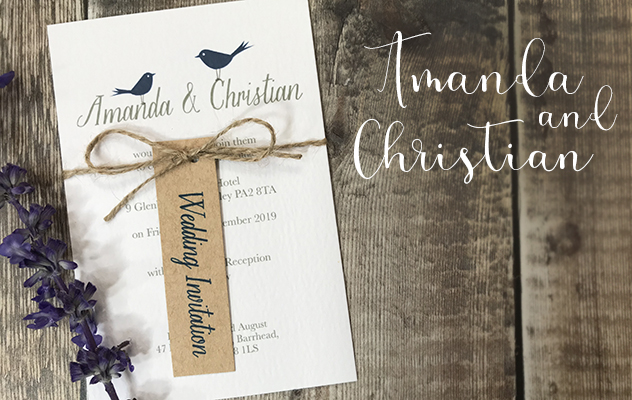
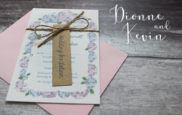
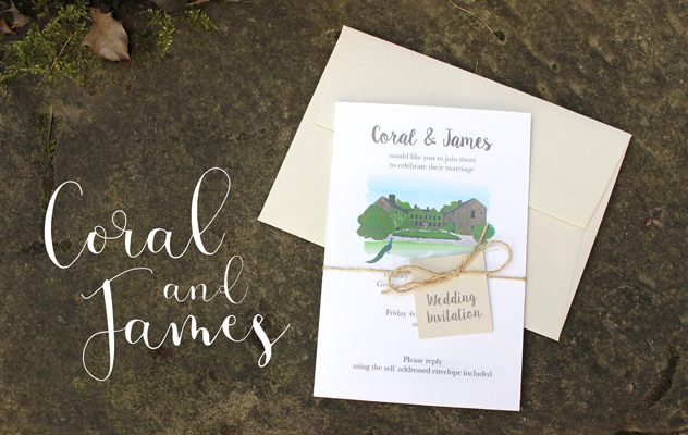
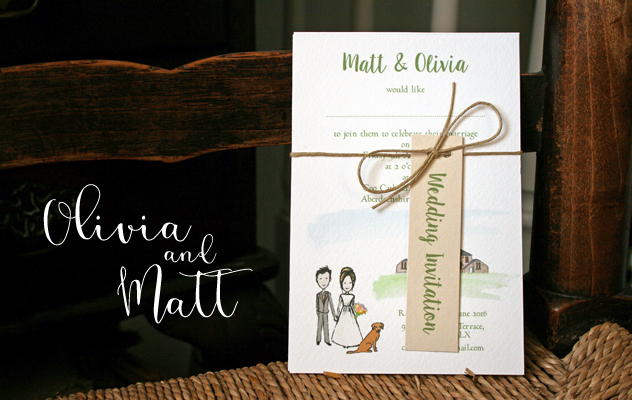
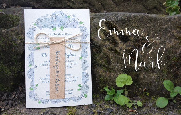
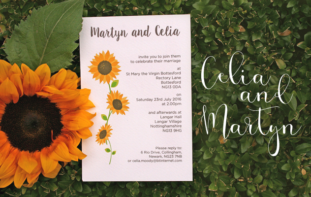
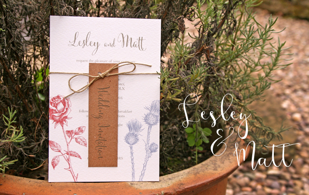
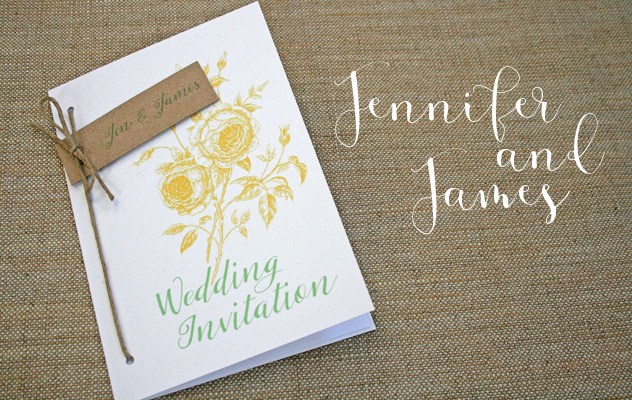
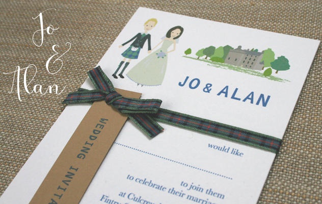
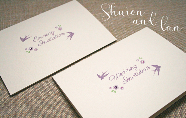
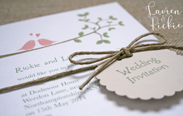
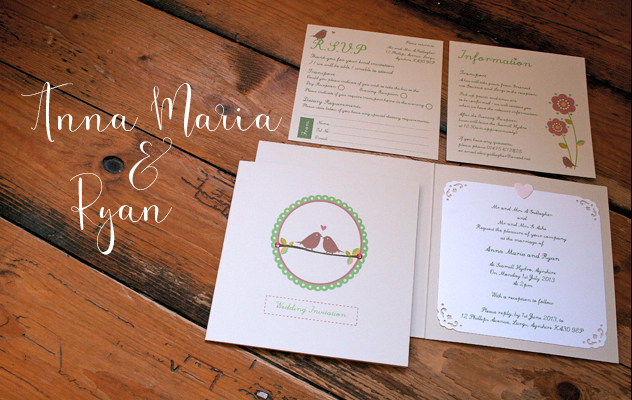
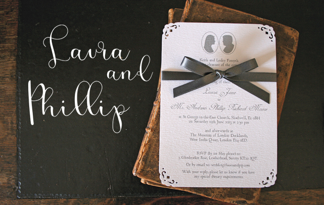
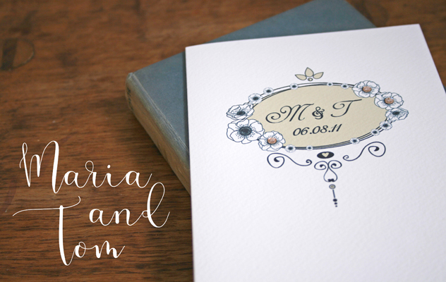
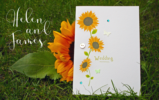
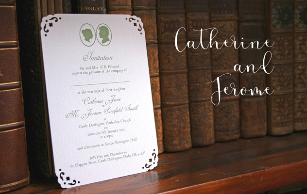
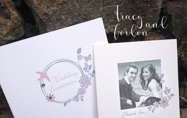
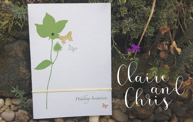
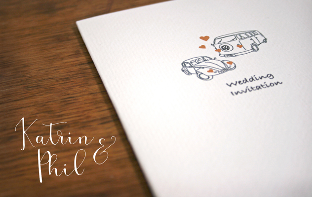
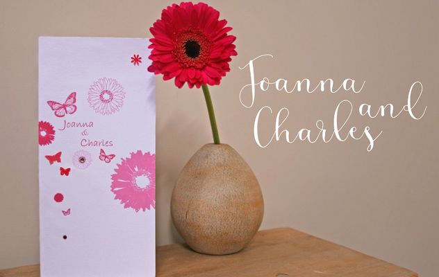
Here are some examples... |
 |
Maria and Tom
Maria and Tom wanted a vintage style for their wedding stationery. We created a decorative frame design, incorporating little anemone flowers around the edge to match Maria’s bouquet. With the bridesmaids in 1930s oyster coloured beaded dresses and the men in navy blue suits, we reflected these colours in the design and with the little sparkly gem stones. Not forgetting their siamese cat who was also included in the design.
Click here to see more images on Facebook. |
 |
Helen and James
Based on the summer daisies range, Helen and James chose sunflowers in their stationery design to match their wedding flowers. With the bridesmaids in a fresh bright green - perfect for a colourful summer wedding.
Click here to see more images on Facebook. |
 |
Catherine and Jerome
Catherine and Jerome wanted a very traditional Georgian style to their stationery. This was a joint effort with Catherine having sent us their cameo silhouettes which we worked into the design. The invitation was created as individual postcards, held together with a paper band, which Catherine finished with a wax seal. Using traditional style fonts and a beautiful sage green colour - a very pretty and classical stationery range.
Click here to see more images on Facebook.
|
 |
Megan and Julian
Megan and Julian came to us for some table stationery for their wedding day. They wanted something traditional and vintage in style and liked our silver floral ring design, but wanted to change the colours to match the raspberry pink in Megan's bouquet and also to somehow reflect the venue. We took inspiration from the dark wooden panelling around the room where their reception would be held and decided on a dark brown for a really rich colour combination. This is a great example of taking colour and style inspiration from your wedding venue helping to visually tie it all together. |
 |
Jo and Andrew
Jo and Andrew's design is a simple colour change of our Confetti Veil design.
We recreated the design in this lovely fresh blue (to match the bridesmaid dresses), finishing off with little silver flowers and silver gems stones. |
 |
Rebecca and Darren
Rebecca and Darren had silver and black for their colour scheme and wanted something very chic, simple and contemporary to reflect this.
We created these black invitations with a silver insert in a tall thin shape to add to the elegant feel. |
 |
Heather and Eddie
Heather and Eddie wanted a very traditional Scottish look to their wedding invitations using thistles and with purple as their colour scheme.
We created these thistle invitations using ribbon down one side and the thistle attached with a little purple bow. |
 |
Gordon and Tracy
Gordon and Tracy chose a variation on our Silver Floral Ring design, using vintage rose and green coloured gem stones. (Tracy, being Irish, asked for a little touch of green to represent the Emerald Isle).
The full range also included Drink Tokens for the evening guests and Thank You cards which incorporated their design with a photograph of the happy couple on their wedding day - a great memento and a lovely personal touch. |
 |
Lisa and Ian
Lisa and Ian's stationery was based on the 'Wedding Band' design.
Their colour theme was brown and gold, so we matched the invitations, changing the print colour to brown and adding shimmery pale gold flowers and little gold gem stones. |
 |
Claire and Chris
This design was based on one of our birthday card designs which Claire had saved. We made slight changes to the colours of the ribbon and little butterflies to match in with their Spring colours.
The table settings included a bonsai tree and little scattered green petals. The table stationery reflected this and helped to complete a lovely fresh look.
|
 |
Katrin and Phil (& baby Hannah!)
Katrin and Phil's invitations were Voltswagen themed! Katrin had a Beetle and Phil had a Campervan, so we based the design on that, adding their names to the number plates.
The wedding was held in Gemany with the invitation text in German (text was supplied), whilst a blessing was held back home combined with the Christening of their baby (so we added a little pram to that version!) |
 |
Joanna and Charles
Joanna and Charles' wedding had a lovely themed look with cerise pink as the chosen colour for the bridesmaid's dresses and pink gerberas in Joanna's bouquet. We based the stationery around their wedding flower and colour, making it all tie in beautifully.
Printed on matt white card, the invitations were in a tall thin format with little pink butterflies added to a pink gerbera print and cerise ribbon used to tie the pages together. A very striking and contemporary design.
|
 |
Clare and Richard
This design was based around a vintage postcard purchased in Paris. We went for a very vintage look with a shimmery soft ivory coloured card, recreating the postcard, attaching it with cream photo corners and adding ribbon as a finishing touch. The result was a very unique and pretty design.
|
 |
Karen and Paul
Karen and Paul wanted a beautiful classic rose design in colours to co-ordinate with their wedding theme. We went for a sophisticated handmade look with the rose tied on with matching chiffon ribbon.
For the order of service we did a very simple text design with matching ribbon down the spine.
|
 |
Miki and Niall
Miki and Niall chose a fresh summery floral design. This was a very handmade design with little cut out flowers, pink sequins and gems finished off with a crisp white ribbon and bow and handwritten text.
Miki (who is Japanese) wanted to incorporate a little Japanese character to the inside of the invitation. This really made a truly unique design.
|
 |
Caroline and Chris
Caroline and Chris had chosen Cuba as their wedding location, getting married by the sea, and wanted to base the design around beautiful shells which they had collected for this purpose.
We did a range of designs using shells, threads and ribbon on a pearlescent golden card. Because of the 3D nature of the design we supplied little white boxes to use in place of envelopes - protecting the shells and making the invitations really special.
|